Trail Notes
Menu Design
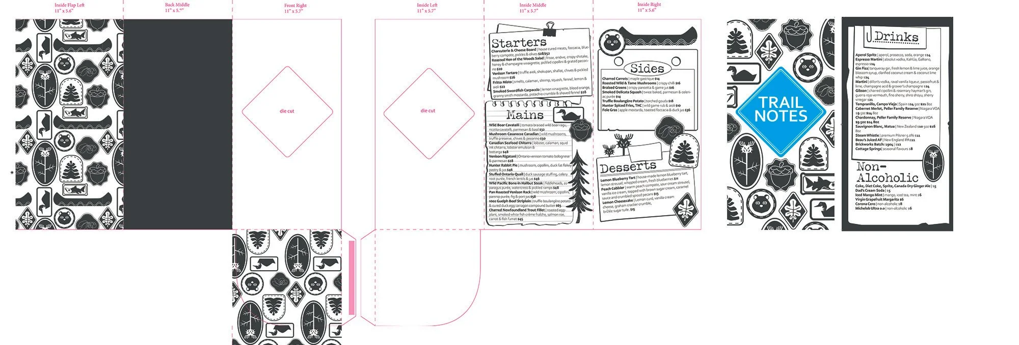
For this piece, my goal was to create a menu for a mid to high-end restaurant that included die-cuts, a specialty finish, and a specialty fold. To accomplish this, I created a simple cutout in the shape of my logo which is featured on the back of the drink menu insert that fits itself nicely into a fold on the inside of the menu. The logo also features a spot varnish.
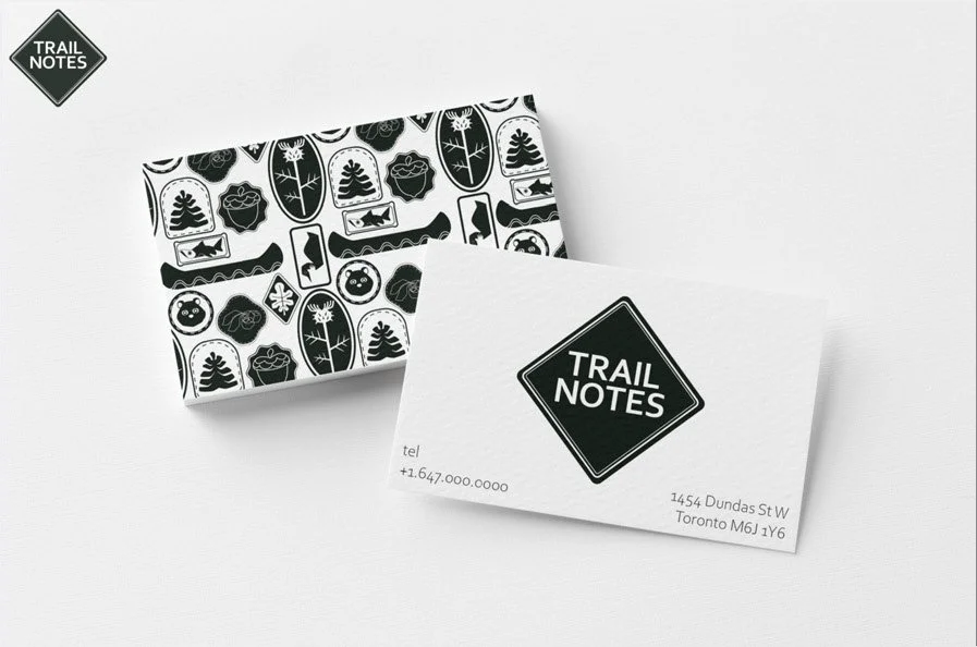
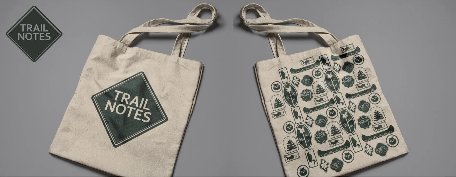
The meals featured on this menu are mostly local or wild game in nature and I wanted to get that across in the concept of this piece. The design includes a lot of Canadian iconography and the pattern is pulled from badges I'd receive from Brownies in my childhood. The name "Trail Notes" is referencing the little notepads you can purchase often used for people who are doing just that, out on trails. With this as inspiration I made the menu appear as though it was on little scraps of paper.
This concept was fun to play with as I love to create pieces that reflect Canada and especially it's wildlife. Once I decided the menu, it was easy for me to envision the look I wanted for the final project. I sketched various pattern (seen below) until I decided to keep it to more simple forms. From there I placed my badges throughout the pages trying to keep the menu visually balanced.
Year
2026
Client
Personal Project